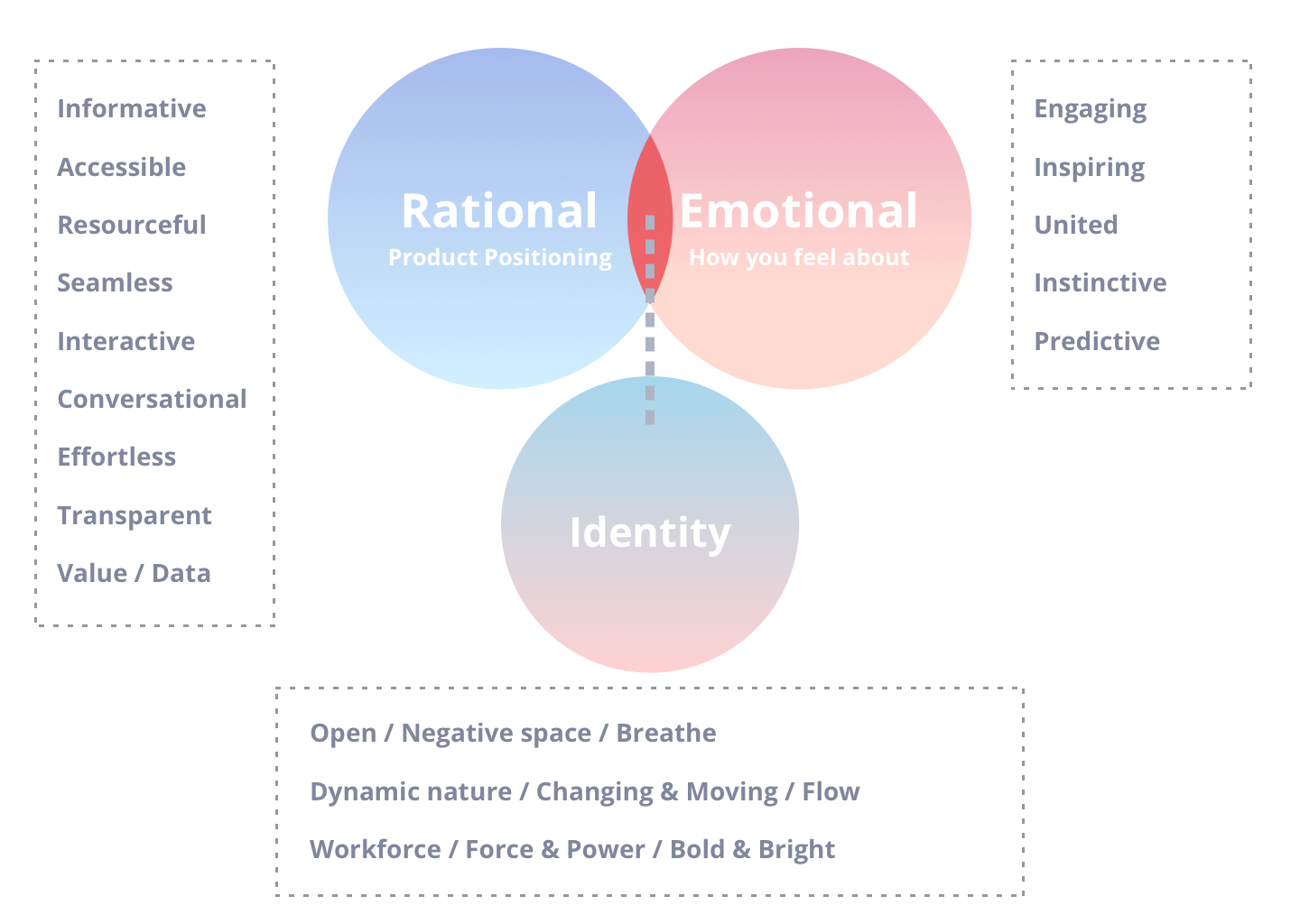
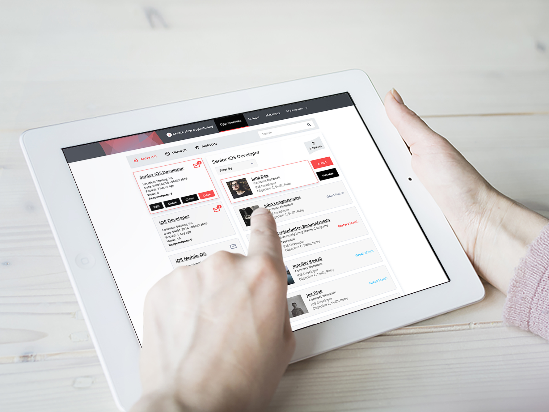
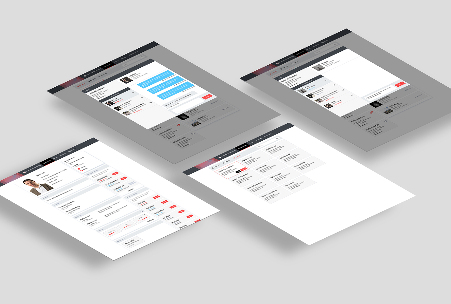
The Challenge
Connect 1.0 looked bare-bones and lacked clear brand expression and visual hierarchy.
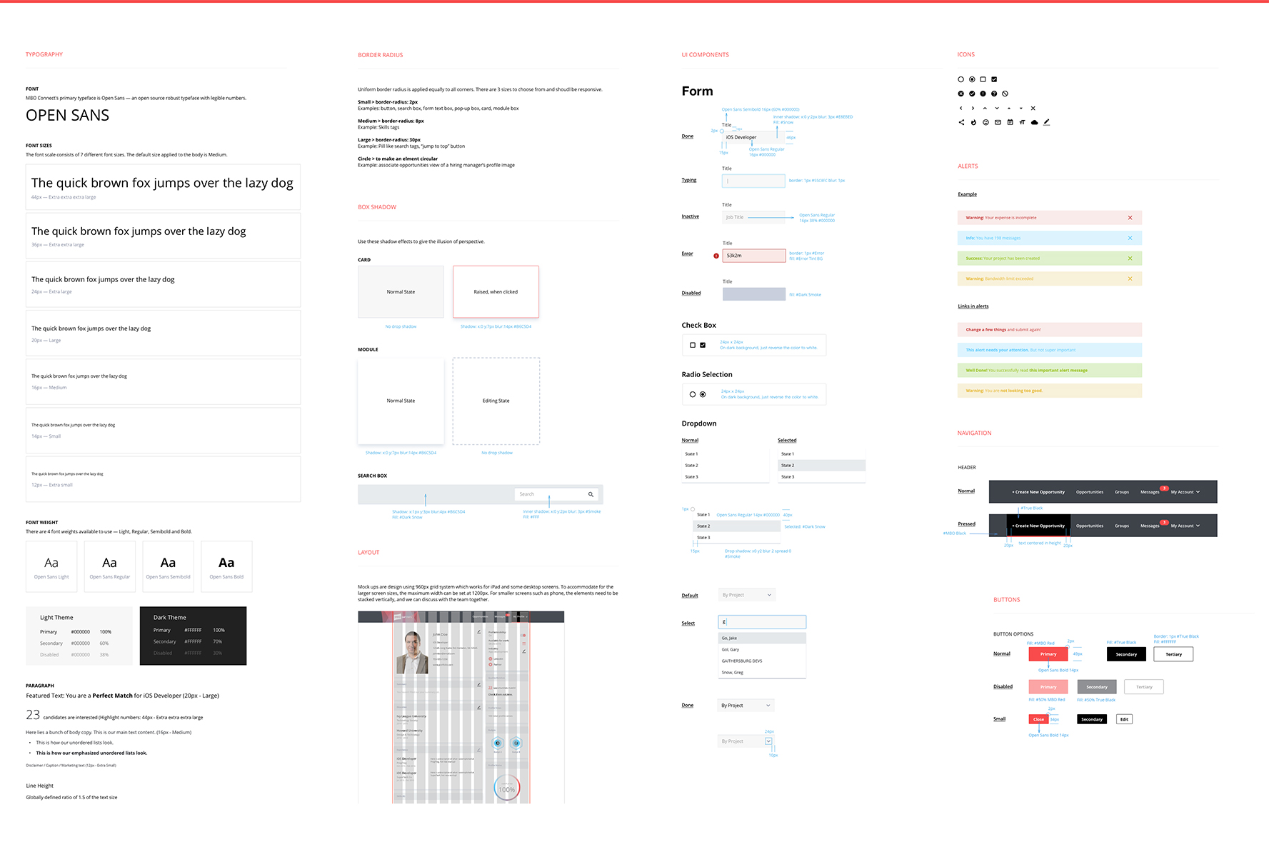
As lead visual designer, I redesigned Connect 2.0 to create a more welcoming, modern, and strong product identity.

Connect 1.0 looked bare-bones and lacked clear brand expression and visual hierarchy.
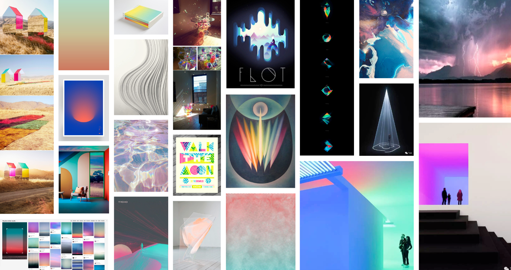
Friendly first impression.
Production-ready visual language.
Trustworthy structure and hierarchy.